This chapter tells you how to use the components included in the Control
Beans package to create a GUI for a control application.
Introduction/Dictionary
Before we start there are a few concepts we would like you to familiarize
yourself with.
-
Tag. Each component will be assigned a numerical value, a so called
tag. Tags are used to determine which components should receive certain
values being sent to them. If for instance a text field and a plotter both
have the tag "42" then they both subscribe to the same values but no other
components will receive those values.
-
Communicator. This is a component used as a kind of "switch". The
other components can register with the communicator which stores a reference
to each. It then makes sure that every component with the same tag receive
the same values. The communicator also provides communication with the
application that the GUI is supposed to be controlling. Exactly how this
is accomplished depends on how the communicator has been implemented. In
our examples, we have included a communicator that uses sockets and the
TCP/IP protocol.
Quick start: A walk-through using NetBeans Developer.
Just a note before we start... As NetBeans Developer is constantly refined
our screenshots may have grown a bit out of date.
We will now show how to make a simple GUI application to show the basics
of how to use the Control Beans package. We will assume that you have NetBeans
Developer installed somewhere on your system and that you have also installed
the Control Beans package as described in the chapter Installing.
The application will contain a communicator, a slider, a bar gauge and
a button. As the work progresses you should every now and then take a peek
in the Editor window and see what code NetBeans is adding.
Starting NetBeans Developer
When you have started NetBeans, you should have a screen looking something
like this. The windows are (from
top to bottom and left to right): Main window; Explorer; Editor; Component
Inspector; Output window. Don't worry if not all of them are showing. Also,
NetBeans' appearance may differ some from that used in our examples. We
have used the Metal (standard Swing) - Look & Feel (this can be set
in the "View" menu).
Selecting a folder to work in.
Create a directory where you want to create this example. The files won't
be particularly large (less then 100 kbytes) so you can place it just about
anywhere.
In the explorer window, right click "Repository" and select "Add
Directory".
A file choice dialog will appear. Select the directory you created
and click "Mount".
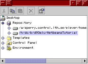
If you click the blue dot at the left of "Repository", it should expand
to show the full contents of the repository. At the bottom, your folder
should be displayed (with a little hard drive symbol and it's full name).

Your folder can later be removed from the repository by right clicking
it and selecting "Remove from repository".
If you try to expand your folder by clicking its blue dot you will see
that it's empty (provided you didn't use some old folder with files in
it).
Creating a new form.
A form is a sort of "canvas" where you place your components. In the Explorer
window, select your folder and right click it. Select the following menuitem(s):
"Add from template | SwingForms | JFrame". A dialog prompting you for a
name will appear. Give the form the name "Tutorial". The form will then
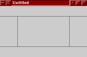
appear, looking something like this:

An empty form. The rectangles represent the different areas of a
FlowLayout.
This shows an empty JFrame with a BorderLayout. If you expand your folder
in the Explorer window it should look like this.
Adding components.
On the component palette, click the "Control Beans" tab. Then click the
symbol for TCP/IP communicator (looks like a little cellular phone). Click
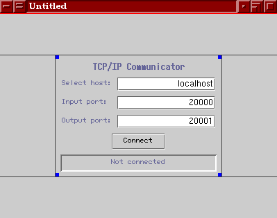
on the center of the form. This will place a TCP/IP Communicator on the
form, making it look like this (you may need to make it bigger, works like
any other window in that respect):
 |
 |
| The form after the TCP/IP Communicator has been added. |
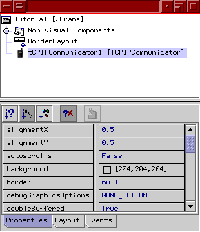
Components being added to the form are also shown in the Component
Inspector. |
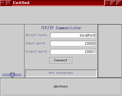
Add a CSlider (it looks a bit funny, we'll get back to that) to the
left of the Communicator and a CBarGauge to the right. Finally add a CButton
below them all. All of these components can be found on the Control Beans
tab. The result looks something like this:

The form with all the components.
Changing properties of the components.
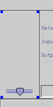
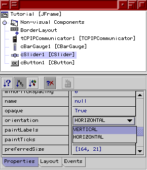
To change the properties of the slider to vertical instead of horizontal
go to the Component Inspector window. Select the icon for the slider and
the tab "properties" at the bottom. Scroll down until you find the property
"orientation". As you can see it is set to "HORIZONTAL". Now click on it
and a down arrow and a pull down menu will appear allowing you to change
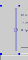
the value to "VERTICAL". When you have done this the slider in the form
changes its orientation.
 |
 |
 |
|
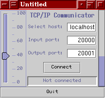
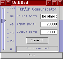
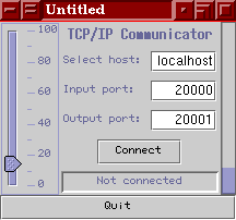
The slider before changing its orientation.
|
The Component Inspector. The properties for cSlider1 are being
displayed.
|
The slider after changing its orientation.
|
Select the different components and scroll through their properties
to get a feel of what can be modified. Change the following properties:
BorderLayout:
| Horizontal gap |
10 |
| Vertical gap |
10 |
tCPIPCommunicator1:
| Variable Name |
aCommunicator |
cBarGauge1:
| tag |
42 |
| Variable Name |
aGauge |
cSlider1:
| majorTickSpacing |
20 |
| minorTickSpacing |
10 |
| paintLabels |
TRUE |
| paintTicks |
TRUE |
| tag |
42 |
| Variable Name |
aSlider |
cButton1:
| text |
Quit |
| Variable Name |
aQuitButton |
Connecting components.
Now all the components have been laid out on the form but if you compile
and run the program, nothing special will happen. We must connect the components
to the communicator. This is how it is done:
-
Click the "connection mode" button.

-
Click the slider. (Can be done in the Component Inspector.)
-
Click the communicator. (Can be done in the Component Inspector.)
-
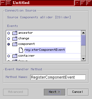
A dialog will appear. It shows all groups of events that the slider can
send. Click the blue dot next to "component". It will expand, showing that
the only component event that can be sent is "registerComponentEvent".
Click that. The text field will now contain a method name. (most likely
"aSliderRegisterComponentEvent"). Change that text to "RegisterComponentEvent".
(This is not needed but it saves you some code later on.) Click 'Next >'.
-
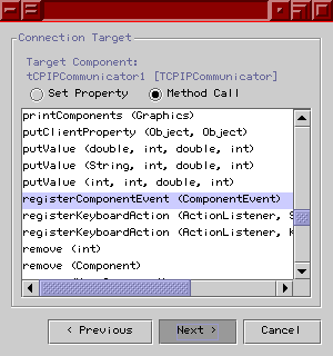
The next page of the dialog will appear. With this page we will determine
what will happen in the target (in this case, the communicator) when the
event is sent from the slider. Select "Method call" at the top. Scroll
down to "registerComponentEvent (componentEvent)". Select it. 'Click Next
>'
-
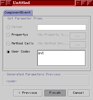
The final page will appear. Select "User Code" and then type "evt" in the
large text area. Click 'Finish'.
 |
 |
 |
|
Selecting which event the event to be sent.
|
Selecting how to receive it.
|
Which text to type is given in the options for NetBeans. "evt"
is the default.
|
-
Repeat the procedure for the bar gauge.
-
Repeat the procedure for the button.
Adding some custom code.
We want the program to end when we click the Quit button. For that we are
going to use the command System.exit().
-
Select the button. (Can be done in the Component Inspector)
-
In the Component Inspector, click the "Events" tab.
-
Click the field next to "actionPerformed". It will be filled with a method
name. (Most likely "aQuitButtonActionPerformed"). Press return.
-
Go to the Editor window. (If it isn't showing, go to the Explorer window.
Find your directory and double click "Tutorial"). If the tab "Tutorial"
isn't selected, click it. This will bring up the source code. Find the
method "aQuitButtonActionPerformed". It will be located near the end of
the file. After the line"// Add your handling code here:",
add "System.exit(0);" Note that the shaded lines of code can't
be edited. Place the cursor at the end of the commented line and press
return to make space for the new line.
Compiling and running.
Now, the program should be ready to run. Press the "Execute" button to
start the program. 
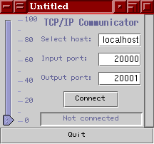
Wait for the program to be saved and compiled. It should then start
and look something like this:

The finished application.
If you drag the slider and let go of it, you will see how the bar gauge
follows. This is because they have the same tag (their tags are set to
"42").
If you press the Quit button, the program will close. And there you
have it, your first Control Beans application.

How to use each component.
This chapter will give a brief description of the different components,
their purpose and various features. All the components have a few things
in common:
-
The attributes isSender and isReceiver. These are boolean
values which are used to determine whether or not the component should
send or receive any values to and from the communicator.
-
The tag attribute. As mentioned before, this attribute determines
which values the component subscribes to. All components with the same
tag receive the same values.
-
All components can send a ComponentEvent.
Such an event must be sent to the communicator in order for the component
to be able to send and receive values from it. To make sure that a component
will send the event, you must register the communicator as a "listener".
In NetBeans Developer, this is done by "connecting" the component to the
communicator (if you are not familiar with this feature in NetBeans Developer,
please refer to the Quick Start chapter of this
document).
If you create your program by writing the code yourself, you may register
the communicator by calling the components addComponentListener
method with the communicator as a parameter. If you wish (depending on
your programming style) you may instead create an adapter class which implements
ComponentListener.
This is the standard procedure when creating event handling. That class
must make sure that the communicators registerComponentEvent
method is invoked when the event is sent.
The CBarGauge is the progress bar from the swing package, slightly
modified to function as a bar gauge with the Control Beans package. This
is a passive component and does not send any values. It can receive both
integer and double values. If a string value is sent to a bar gauge it
will be ignored.
The CButton is an ordinary button. When clicked the button will
send the integer value "1" to the communicator. This component ignores
all values being sent to it.
The CCheckBox is an ordinary check box. When selected it will
send the integer value "1" to the communicator. When deselected it will
send the integer value "0". The state of the component can also be set
by sending values to it. The value "0" will deselect the component, while
all other values will select it.
The CPlotter is a panel with a few modifications. This is a passive
component and it does not send any values. It can receive both integer
and double values. If a string value is sent to the plotter it will be
ignored.
When a value is sent to the plotter it will be stored within it and
then plotted. The maximum number of values a plotter can hold is determined
by the capacity attribute. The value itself will be the y-value
while the time for the value will be the x-value.
A plotter can plot more then one curve. Instead of the usual tag
attribute, the plotter has a tags attribute which is an array
of integers. To separate the curves, you can give them different colours
by changing the colors attribute. colors is an array
of Color.
tags
and colors work like this: the curve that has a tag in tags[0]
gets the color of colors[0], the curve with its tag in tags[1]
gets the color of colors[1] and so on. If colors is smaller
then tags (not as many colors as tags) the last curves will be
black.
Plotter also has the following attributes:
xMajorTickSpacing, xMinorTickSpacing, yMajorTickSpacing,
yMinorTickSpacing:
The spacing between the big and small lines (major and minor ticks) on
the two axis. The major ticks also have their value as labels next to them.
drawTicks: Boolean value telling if the ticks should be drawn
or not.
drawAxis: Boolean value telling if the axis should be drawn
or not.
refreshrate: Specifies how often the plotter should be updated.
This is given in milliseconds.
xRange, yRange: Specifies over how large range the
x-axis and y-axis should span.
yOffset: Specifies the lowest value on the y-axis.
The CRadioButton is an ordinary radio button. When selected it
will send the integer value "1" to the communicator. When deselected it
will send the integer value "0". The state of the component can also be
set by sending values to it. The value "0" will deselect the component,
while all other values will select it. NOTE: In order for a radio button
to part of a group, it has to be added to a ButtonGroup.
You can achieve this either by writing the code yourself or you can place
the radio buttons you wish to group in a CRadioButtonPanel.
The CRadioButtonPanel is an ordinary panel with a ButtonGroup
added. It is only used to group radio buttons and does not send or receive
any values.
The CScrollbar is an ordinary scroll bar. The CScrollbar
can send and receive integer and double values, received string values
are ignored. A slider normally only sends and receives integer values which
is why CScrollbar has the added attribute divisor. Before sending
a value, CScrollbar will divide it with divisor. Correspondingly,
when receiving a value, it will be multiplied with divisor. NOTE: We do
not recommend use of this component as it has been replaced by the more
useful CSlider.
The CSlider is an ordinary slider from the swing package. The
CSlider
can send and receive integer and double values, received string values
are ignored. A slider normally only sends and receives integer values which
is why CSlider has the added attribute divisor. Before sending a value,
CSlider will divide it with divisor. Correspondingly, when receiving a
value, it will be multiplied with divisor.
The CTextArea is an ordinary text area. The text area receive
integer, double and string values, but it cannot send any values. It is
useful for debugging purposes.
The CTextField is an ordinary text field. The text field can send
and receive integer, double and string values. When a user types in a text
into the component, it will first try to convert the string to an integer
before sending it. If that can be done, it will try to convert it to a
double value. If that isn't possible either, the value will be sent as
a string.

How to use non control components.
Sometimes you may wish to use a component that is not included in the Control
Beans package to create your GUI. Since those components does not support
the Control Beans protocol you have to use the CRelay component.
The CRelay component is used for communication with components
which are not part of the Control Beans package. This component will receive
values from the communicator and alert the non control component by sending
an event. It may also receive events from the non control component, fetch
the value from the component and send it to the communicator. Here is how
you use it:
-
Connect the CRelay component to the communicator.
-
Connect the non control Component to the CRelay component in such
a way that when someone changes the value of the non control component,
the event telling that this has happened will be sent to CRelay.
The most common events are ActionEvent
and AdjustmentEvent. Make it so that one of CRelays setValue
methods are invoked and that the parameter for this method is fetched from
the components value (or any corresponding) attribute.
-
Connect the CRelay component to the non control component in such
a way that when the non control component receives a RelayEvent,
the value (or corresponding) attribute is set to either intValue,
doubleValue
or stringValue which are found in the CRelay component.
CRelay may also convert integer to double values and vice versa before
sending them to the communicator or passing them to the non control component.
The attributes sendDoubleAsInt, sendIntAsDouble, receiveDoubleAsInt
and receiveIntAsDouble controls the conversions.

The TCP/IP Communicator.
This is a communicator designed to be used over a TCP/IP network, such
as Internet. It uses two sockets, one for input data and one for output
data. The communicator first opens the output socket and then the input
socket which means that if you write a server for this communicator, you
will have to open the servers input socket first (or make sure it can listen
to two sockets at once). After the sockets have been opened, the communicator
requests a stream from each socket. The streams are of the types DataInputStream
and DataOutputStream.
When a component sends a value to the TCP/IP Communicator, the communicator
sends the value over the output socket according to the following protocol:
-
type (int)
-
tag (int)
-
value(int, double or string) (depends on type)
-
time(double) (optional, depends on type)
The type is an integer which can be one of the following: 1, 2,
3, 11, 12, 13.
If the type is 1 or 11, value will be an integer.
If it is 2 or 12, value will be a double and if it is 3 or 13,
value
will be a string.
If the type is 1, 2, 3, time will not be sent but
for the other types it will be.
When receiving a type that is not one of the above, the communicator
will assume that there has been an error and shut down the sockets.
Strings are written and read to and from the streams with the methods
writeUTF()
and readUTF().
The communicator has two attributes which controls its appearance:
statusfield
and editable. These are boolean values which determine whether
or not the small statusfield and the text fields respectively should be
shown.

Troubleshooting/FAQ.
-
Since NetBeans uses adapter classes to connect the components to the communicator
it must be created before the components. This can be achieved by using
NetBeans Component Inspector. If you right click a component that has been
added to a form, you can move it up or down by selecting the corresponding
item in the menu.


